I ♥ San Francisco
16 June 2015
If you follow typography or Apple at all, you’ve probably heard the upcoming iOS9 and Mac OS X El Capitan will use San Francisco as their system font, rather than the controversial Helvetica Neue.
I love the change.
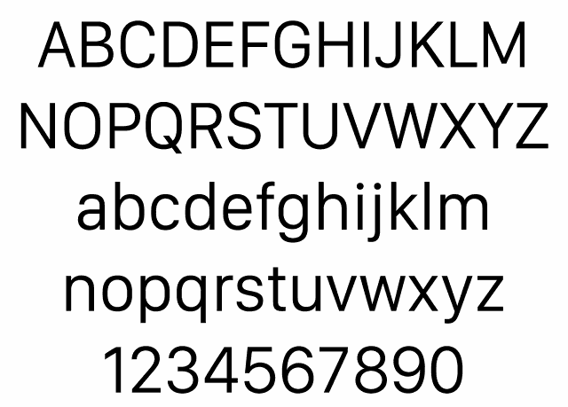
I fell in love with San Francisco the moment Apple introduced it as the font for the Apple Watch. I love its clean lines, slightly compressed letterforms and generous horizontal spacing. It has a precision-machined feel to it reminiscent of DIN 1451.
I tried it out as my system font using the technique described in this Gizmodo post and absolutely loved it for both aesthetic and legibility reasons. This Wired article discussing the switch from a typographer’s perspective pretty much sums up my impression.
Sadly, the early versions of the font didn’t have all the glyphs and weights necessary to be a system font in OS X. The resulting display glitches ultimately convinced me to switch back. That won’t be an issue anymore.
Apple has now posted official versions of the font for download, along with tools for working with fonts in OS X and iOS and specifications for the TrueType fonts and their ‘advanced’ font rendering technology. They’ve also posted a video of the WWDC session on San Francisco.
Back in the day, Susan Kare’s ‘city’ fonts — New York, Chicago, Geneva, and Monaco — were staples on the Mac. Apart from Monaco, which is still in use as the default monospace font in OS X, they’ve mostly fallen by the wayside since OS X replaced Chicago and Geneva were replaced by Lucida Grande as they system font in OS X 10.0. San Francisco is a welcome revival of the series.
This post was also published on the Tobias & Tobias blog.